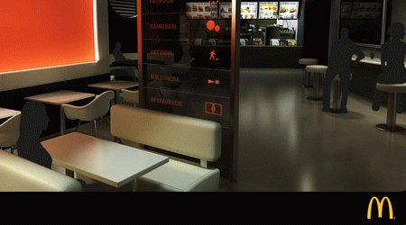
“Mcdonalds” are one of the big hotcho, big kahuna of fast food services 🙂 Although 60% of services based website are just plain 1990s but this one sure grab my attention when i visited their site.

screenshot taken from mcdonalds.pl
Poland based Mcdonalds website are based on flash interface design, the interface kind of catchy with shadow customers and some delivered flash food in the table. I was wondering why there only 2 customers in the flash? The flash interior design of Mcdonalds looks like a high expensive restaurant…doesn’t fit to our ordinary family fast food joint..don’t ye think but heck the flash sure impressive..
Personal Thought
The site flash design are awesome with all the mini stuff that playing around…navigation kind of confusing tho 😉 here’s a hint, watch the soccer ball rolling…if not mistaken a mighty mouse just stole the ball 👿
hear out the background song “i’m loving it”
You can visit the site and experience it yourself 🙂
