There’s a saying “first impression is very important”. That’s why how you present your product or company brand will determine your successfulness in the future. Take aside the brand’s packaging and design, it is the font that your product and company logo implement will determine if it will outshine others.
Font had become a significant part of today society. Everywhere you’ll see a different fonts used in branding such as Starbuck, Facebook and Yahoo among other big brand names. Each font could represent the brand’s identity and business type in first look. However there’s millions of fonts you could find in design community, how would you decide which font type is suitable for your company brand? before that, let’s explore further on different fonts type and classification.
What types of fonts are there?
There are more than one typeface you could find in font style. Typeface categorize each font into a different group with its own unique typography style presentation. Here are list of widely use font types:
1. Serif or Roman Typeface

These typeface usually have a little ‘curve’ at the end of its type, commonly seen in serif fonts such as Times Roman and Garamond. These typeface mostly used in printed material branding such as newspaper and magazine, they generally look more traditional and solemn.
2. Sans serif Typeface

These typeface are popular among designers nowadays. Designer preferred the smooth and clearness of sans serif typeface. Without the ‘curve’ at the end of its type, they’re generally look more modern and contemporary. For this reason, many designer used these typeface in web design, advertisement design and even on logo brand design. Generally designers like to use modern fonts such as Proxima Nova and Gotham font.
3. Script or Handwriting Typeface

These type of typeface showed in cursive and handwritten style. They usually have letters connect to each other and sometime in italics. Script fonts have many different styling such elegant, fun, casual and hand-drawn style. They generally used in historic or renaissance type designs.
4. Decorative or Display Typeface

As the typeface’s name, it means to grab people attention, they usually comes in big, bold and loud, if you know what i mean 🙂 designer often use display typeface for headline in ads and poster design. They give a heavier weight to eyes compare to other typeface. If you put display typeface between serif and sans serif typeface font, you’ll notice the difference.
5. Monospaced Typeface

These typeface usually have equal spacing in letters. They were first introduce for type writer lettering format. One of the advantage of monospaced typeface is that they look great in smaller size due to its letters and characters each occupy the same amount of horizontal spacing, making them perceptible even in diminutive size. Courier, Prestige Elite, Fixedsys, and Monaco are among widely used monospaced fonts.
Other than these five typeface, there’re still a Blackletter, Letterhead, Gaelic, Reverse-contrast, effect and CJK (Chinese, Japanese and Korean) typefaces.
Choosing the font for Your Brand
Finding a befitting font for your brand is not easy, generally you’ll either go for serif or sans serif font type. However choosing one of these font type to represent your brand will need some length of research toward your business objective. Let’s do some probe on popular company or brand’s fonts practice.
Serif or Monospaced Fonts for News
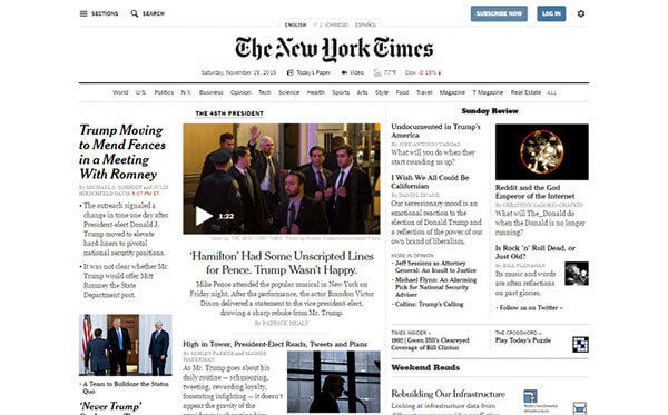
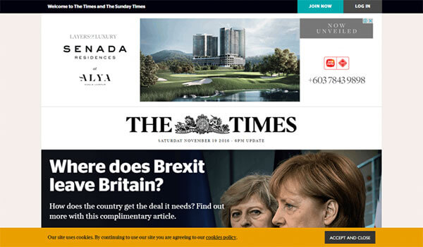
Serif and Monospaced font type are great for newspaper or magazine website since these typeface is more traditional and legitimate where important news sites needed to show. With heavy content news site such as The New York Times using monospaced or The Times UK using serif font for their logo branding, without a doubt these two typefaces were favored by news magazine related business.

The New York Times use ‘monospaced’ font type for their logo.

The Times UK use ‘serif’ font type for their logo.
Sans Serif Fonts for Blog or Personal or in general use
Sans serif fonts such as Proxima Nova, Gotham or Graphik Web are popular among logo and brand designers. These three fonts not only look clear and crisp, its also have a nice round edge that easy to read. They’re few of the best modern contemporary fonts for logos today.
Did you know? – Proxima Nova is named as 2013 Font of the year by Typ.io
Although some thought Proxima Nova font is overly used in web type nowadays so the uniqueness of using these fonts are decreasing. However, if you still love using sans serif fonts, there are a few alternative that might brighten up your day.
Take for example popular brand such as Facebook or Microsoft use sans serif font type for their brand. Although there’s some transition way back when Microsoft redesign their logo and gotten some negative feedback for being ‘too simple’ in their logo design, well they were hoping to re-brand their trademark into a simpler text mark and its proven a success, i personally prefers the new Microsoft logo.

Display Fonts if You Want to Send a Message
Big and bold font such as display font type is great for acknowledge or some level of recognition on your message. Therefor these font type is suitable to use in poster ads or sign board message.
Here are few example of display font type:
Ratio display font type
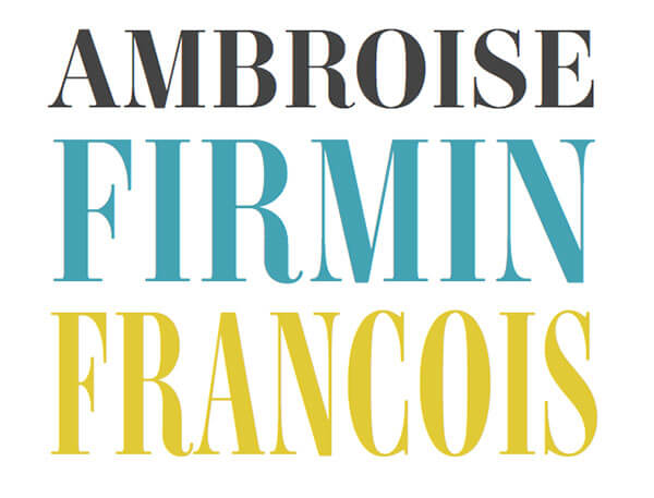
Ambroise display font type

Both of these font type are not free, you’ll need to purchase or subscribe to use. If you’re looking for a free display font, you might want to check out:
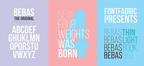
Bebas Neue display font
Conclusion
As you finish reading right about now, it is a understand that serif font type is great for news magazine, sans serif font type is preferred by designers nowadays for logo and branding usage, display font type look better in large size ads or poster.
Here are some other well-known fonts that are currently trending:
[list type=”check”]
- Roboto
- Avenir
- Lato
- Montserrat – some say its a perfect alternative for Proxima Nova
- FF Meta Serif
[/list]
If you’re looking for more creative font usage, check out this real world font gallery example.


